



Fontke.com>Article>Details
National Trust Tree Appeal Poster
IntroductionSource: http://www.davidgentleman.com.David Gentleman. License: A


Source: http://www.davidgentleman.com.David Gentleman. License: All Rights Reserved.
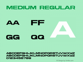
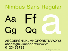
This poster design by fashionable in the 1970s. In case you are looking for a digital font that comes close to this, forget about the ones that are named Helvetica. Apart from the too loose spacing and the differences in the overall proportions, they don't have that restrained exit stroke on 'a'. Better options are Neue Haas Grotesk Display Medium and URW's Nimbus Sans P (Poster) Bold. Latter has the longer ascender on 't'.
Relevant font family




National Trust Tree Appeal Poster Comments
National Trust Tree Appeal Poster Latest comments
No relevant comments
-
 ShanhaiFonts
Brand:山海字库
Area:China

-
 Cangji Fonts
Brand: 仓迹字库
Area: China
-
 JT Foundry
Brand: 翰字铸造
Area: Taiwan, China

-
 Handmadefont
Brand:
Area: Estonia

-
·千图字体
-
 HyFont Studio
Brand: 新美字库
Area: China





Recommended font article
- ·MC5 – Back in the USA album cover
- ·Hollywood Star Matt Damon Wrote Better Chinese than Chinese Stars
- ·Top 100 Fonts.com Web Fonts for May 2016
- ·The Future of Sex poster
- ·Barbe à papa Cotton Candy
- ·The Great Comic Book Heroes, by Jules Feiffer
- ·Make market-ready fonts with this 8 point checklist
- ·How House Industries Designs Its Retrotastic Logos and Typefaces
- ·Once Upon DESIGN: New Routes for Arabian Heritage
- ·Moving Hands (Helena Hauff Remix) by The Klinik, official video