



Rossmann logo


Photo: Florian Hardwig. License: CC BY.
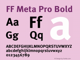
Talking about customizing typefaces for logos: Like the new Yahoo wordmark, the Rossmann logo is based onOptima. More precisely, on Optima Medium, judging from the blunt apexes. The concave stems have been straightened and the terminals in 'S' sheared vertically. Such simplifications are common and advisable when one wants to tone down letterforms with calligraphic or otherwise fuzzy details for a logotype. They can't be lumped together with illiterate modifications like the forced symmetry in the aforementioned case, or the infamous and ever-popularFF Meta.
Rossmann is Germany's second largest health and beauty retailing chain. Founded in 1972 by Dirk Roßmann, the company now operates more than 2,700 stores in Germany, Albania, Czech Republic, Hungary, Poland and Turkey.

Source: http://www.rossmann.de.License: All Rights Reserved.

Photo: Florian Hardwig. License: CC BY.
This is how the logo and the slogan would look like in off-the-shelf Optima and FF Meta Pro.


-
 ShanhaiFonts
Brand:山海字库
Area:China

-
 Cangji Fonts
Brand: 仓迹字库
Area: China
-
 JT Foundry
Brand: 翰字铸造
Area: Taiwan, China

-
 Handmadefont
Brand:
Area: Estonia

-
·千图字体
-
 HyFont Studio
Brand: 新美字库
Area: China





- ·Jim Nutt: Coming Into Character at Museum of Contemporary Art Chicago
- ·Troubadour poster, Opera Plovdiv
- ·London Underground's iconic Johnston Sans typeface
- ·Iconic Transport for London logo undergoes subtle redesign
- ·MC5 – Back in the USA album cover
- ·Food Not Bombs hypothetical redesign
- ·Linotype Ad: "Linotype vs. Intertype"
- ·He Invented a Font to Help People With Dyslexia Read
- ·Benetton identity redesign
- ·Once Upon DESIGN: New Routes for Arabian Heritage