


'Who the Fraggle designed this?': Sufjan Stevens won't put up with bad typography

He may plough an individual furrow musically, but singer-songwriter Sufjan Stevens won't stand for typographical unorthodoxy, it would appear.
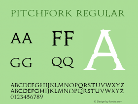
The Casimir Pulaski Day hitmaker took time out from composing songs in a 65/16 time signature to 'savage' the album sleeve of Silence Yourself, the first full-length recording by the British band Savages. Stevens pounced gleefully on the font, the leading, the italicisation and what he felt was an unnecessary line break.
"The very cool SAVAGES has allowed a very uncool typographical blunder on its LP cover: Helvetica Narrow (weight loss is the worst thing that can happen to an iconic font, aka iOS 6)," Stevens wrote on his website.
"Also can we talk about the weird italics (unnecessary affectation, and very un-British), cramped leading (totally unforgivable) and unnecessary line break? Who the Fraggle designed this?"
Stevens hasn't always had the best of luck with his own record sleeves; fears of legal reprisals by DC Comics led to the picture of Superman on the front of Illinois being covered with a balloon sticker.
Here's the offending sleeve; what do you reckon?

[Via Pitchfork]


-
 ShanhaiFonts
Brand:山海字库
Area:China

-
 Cangji Fonts
Brand: 仓迹字库
Area: China
-
 JT Foundry
Brand: 翰字铸造
Area: Taiwan, China

-
 Handmadefont
Brand:
Area: Estonia

-
·千图字体
-
 HyFont Studio
Brand: 新美字库
Area: China


- ·Moving Hands (Helena Hauff Remix) by The Klinik, official video
- ·Benetton identity redesign
- ·Antropofagia. Palimpsesto Selvagem
- ·Barbe à papa Cotton Candy
- ·Alphabet Stories by Hermann Zapf
- ·Linotype Ad: "Linotype vs. Intertype"
- ·He Invented a Font to Help People With Dyslexia Read
- ·Fonts Design of Childhood Memory
- ·Top 100 Fonts.com Web Fonts for May 2016
- ·XUID Arrays: One Less Thing To Worry About