



Gothic/Myungjo or Dotum/Batang?
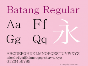
The prototypical Serif and Sans Serif typeface style distinction in Korean has traditionally used the names Myeongjo (명조체/明朝體 myeongjoche) and Gothic (고딕체/고딕體 godikche), respectively. But, in 1993, the Republic of Korea (South Korea) Ministry of Culture, in an attempt to standardize typographic terms, recommended the use of Batang (바탕 batang) and Dotum (돋움 dotum) as the proper names for these two typeface styles.
At the time the Ministry of Culture recommendation was made, which was a period when printing was the most common use of fonts, Batang was meant for body text, and Dotum was for display or emphasis purposes. Mobile devices have provided a new use for Dotum, because its lack of serifs provided superior readability on mobile devices with smaller screens that necessitated smaller point sizes, and the original rationale for these new names seems to no longer apply.
From what I can tell, Korean type foundries have not embraced the Batang and Dotum names, and have actually resisted their use. What probably didn't help was the fact that Microsoft released TrueType fonts with these exact names, with no additional qualifiers: Batang and Dotum. In other words, it seems that Microsoft's use of these names polluted their chance at more widespread use, because they were treated as typeface names, not typeface style names.
In closing this brief article, I am curious about what our blog readership thinks about this particular issue. I welcome any and all comments.
-
 ShanhaiFonts
Brand:山海字库
Area:China

-
 Cangji Fonts
Brand: 仓迹字库
Area: China
-
 JT Foundry
Brand: 翰字铸造
Area: Taiwan, China

-
 Handmadefont
Brand:
Area: Estonia

-
·千图字体
-
 HyFont Studio
Brand: 新美字库
Area: China





- ·The Future of Sex poster
- ·Chinese College Student Invents Smog Font
- ·Make market-ready fonts with this 8 point checklist
- ·Moving Hands (Helena Hauff Remix) by The Klinik, official video
- ·"Die Alpen – Vielfalt in Europa" stamp
- ·Amazon Releases Ember Bold Font for the Kindle
- ·XUID Arrays: One Less Thing To Worry About
- ·"Fantastic!" ad for Captain Fantastic & the Brown Dirt Cowboy by Elton John & Bernie Taupin
- ·London Underground's iconic Johnston Sans typeface
- ·Barbe à papa Cotton Candy