


ATypI 2013 – Point Counter Point, Amsterdam (NL), 9–13 October 2013


Source: http://www.atypi.org.License: All Rights Reserved.
Posted as part of a little survey about websites for conferences on typography and graphic design – how do these specialist events present themselves typographically, in 2013?
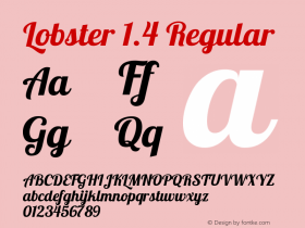
This year's TypeCon, there is not much too see on the website yet. All conference-related information is embedded in the general ATypI website, which saw a design overhaul a while ago. The lobster-red bars seem to cite modernist typography. Veteran Rockwell is paired with the web-optimized Benton Sans RE. Very clear, very sober.
Webfonts: ✓ (4 styles via Webtype)
Designer credits: ✗
Typeface credits: ✗

Source: http://www.atypi.org.License: All Rights Reserved.

Source: http://www.atypi.org.License: All Rights Reserved.


-
 ShanhaiFonts
Brand:山海字库
Area:China

-
 Cangji Fonts
Brand: 仓迹字库
Area: China
-
 JT Foundry
Brand: 翰字铸造
Area: Taiwan, China

-
 Handmadefont
Brand:
Area: Estonia

-
·千图字体
-
 HyFont Studio
Brand: 新美字库
Area: China


- ·Ad for Vincebus Eruptum by Blue Cheer
- ·Once Upon DESIGN: New Routes for Arabian Heritage
- ·"David Bowie is turning us all into voyeurs" button
- ·Statement and Counter-Statement, Automatically Arranged Alphabets, and Arts/Rats/Star
- ·Surabaya Beat by Beat Presser, Afterhours Books
- ·"Jesus Music" ad for Myrrh Records
- ·Chinese College Student Invents Smog Font
- ·20 Houses. A New Residential Landscape exhibition, Wallpaper* Architects Directory
- ·The Form Book by Borries Schwesinger
- ·He Invented a Font to Help People With Dyslexia Read