


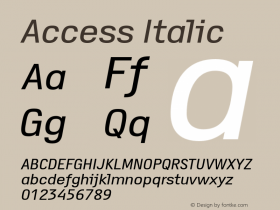
Typism, Gold Coast (AUS), 4 September 2013


Source: http://typism.com.au.License: All Rights Reserved.
Posted as part of a little survey about websites for conferences on typography and graphic design – how do these specialist events present themselves typographically, in 2013?
Typism has a cute voguish logo, lettered by Aurelie Maron. There is an official conference typeface, but it is not used for the website. Not everyone will find the light grey on middle grey text easy to read. Laudably, the site has been optimized for a number of screen widths. Unfortunately, tablets in portrait orientation was not one of them (see menu). It is easy to miss the main information, since accessing it requires a double click on "About". Well, the event is still some time away. Let's see how this evolves. The base is not as bad as it may sound here.
Webfonts: ✓ (≧4 styles via Google)
Designer credits: ✗
Typeface credits: ✗

Source: http://typism.com.au.License: All Rights Reserved.

Source: http://typism.com.au.License: All Rights Reserved.


-
 ShanhaiFonts
Brand:山海字库
Area:China

-
 Cangji Fonts
Brand: 仓迹字库
Area: China
-
 JT Foundry
Brand: 翰字铸造
Area: Taiwan, China

-
 Handmadefont
Brand:
Area: Estonia

-
·千图字体
-
 HyFont Studio
Brand: 新美字库
Area: China


- ·Cocoa Marsh Instant Fudge Candy Mix packaging
- ·Benetton identity redesign
- ·The Great Comic Book Heroes, by Jules Feiffer
- ·Why Apple Abandoned the World's Most Beloved Typeface?
- ·Amazon Releases Ember Bold Font for the Kindle
- ·10 Top Romantic Fonts on Valentine's Day!
- ·20 Houses. A New Residential Landscape exhibition, Wallpaper* Architects Directory
- ·Cher Got Sued For Font!
- ·New York New York, Jazz St. Louis
- ·Japanese Typography Writing System