


Kerning Conference, Faenza (I), 2–3 May 2013


Source: http://www.kerning.it.License: All Rights Reserved.
Posted as part of a little survey about websites for conferences on typography and graphic design – how do these specialist events present themselves typographically, in 2013?
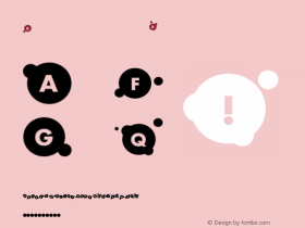
The Kerning website is strongly branded in red and black and a contrasty pair of fresh typefaces: the wide Pluto Sans (sometimes a little light) and the seriffed Adelle (sometimes quite heavy). The layout is responsive. The feedback thingy on the bottom with its gradient speech bubble quickly gets annoying and almost ruins the experience.
Webfonts: ✓ (4 styles via Typekit)
Designer credits: ✗
Typeface credits: ✗

Source: http://www.kerning.it.License: All Rights Reserved.

Source: http://www.kerning.it.License: All Rights Reserved.

Source: http://www.kerning.it.License: All Rights Reserved.

Source: http://www.kerning.it.License: All Rights Reserved.


-
 ShanhaiFonts
Brand:山海字库
Area:China

-
 Cangji Fonts
Brand: 仓迹字库
Area: China
-
 JT Foundry
Brand: 翰字铸造
Area: Taiwan, China

-
 Handmadefont
Brand:
Area: Estonia

-
·千图字体
-
 HyFont Studio
Brand: 新美字库
Area: China


- ·Moving Hands (Helena Hauff Remix) by The Klinik, official video
- ·The Future of Sex poster
- ·Why Apple Abandoned the World's Most Beloved Typeface?
- ·How House Industries Designs Its Retrotastic Logos and Typefaces
- ·XUID Arrays: One Less Thing To Worry About
- ·Barbe à papa Cotton Candy
- ·Fonts Design of Childhood Memory
- ·London Underground's iconic Johnston Sans typeface
- ·Top 100 Fonts.com Web Fonts for May 2016
- ·Type terms: the animated typographic cheat sheet