


Kerning Conference, Faenza (I), 2–3 May 2013


Source: http://www.kerning.it.License: All Rights Reserved.
Posted as part of a little survey about websites for conferences on typography and graphic design – how do these specialist events present themselves typographically, in 2013?
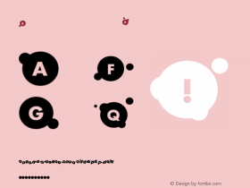
The Kerning website is strongly branded in red and black and a contrasty pair of fresh typefaces: the wide Pluto Sans (sometimes a little light) and the seriffed Adelle (sometimes quite heavy). The layout is responsive. The feedback thingy on the bottom with its gradient speech bubble quickly gets annoying and almost ruins the experience.
Webfonts: ✓ (4 styles via Typekit)
Designer credits: ✗
Typeface credits: ✗

Source: http://www.kerning.it.License: All Rights Reserved.

Source: http://www.kerning.it.License: All Rights Reserved.

Source: http://www.kerning.it.License: All Rights Reserved.

Source: http://www.kerning.it.License: All Rights Reserved.


-
 ShanhaiFonts
Brand:山海字库
Area:China

-
 Cangji Fonts
Brand: 仓迹字库
Area: China
-
 JT Foundry
Brand: 翰字铸造
Area: Taiwan, China

-
 Handmadefont
Brand:
Area: Estonia

-
·千图字体
-
 HyFont Studio
Brand: 新美字库
Area: China


- ·20 Houses. A New Residential Landscape exhibition, Wallpaper* Architects Directory
- ·Jim Nutt: Coming Into Character at Museum of Contemporary Art Chicago
- ·Antropofagia. Palimpsesto Selvagem
- ·"Jesus Music" ad for Myrrh Records
- ·Königsblut identity
- ·Alphabet Stories by Hermann Zapf
- ·Moving Hands (Helena Hauff Remix) by The Klinik, official video
- ·Amazon Releases Ember Bold Font for the Kindle
- ·Once Upon DESIGN: New Routes for Arabian Heritage
- ·Cocoa Marsh Instant Fudge Candy Mix packaging