



Italian Vanity Fair (Feb–Mar 2013)


Source: http://devinpedzwater.wordpress.com.License: All Rights Reserved.
H&FJ DidotandVF Sans. The latter was designed in the late '90s by James Montalbano for Vanity Fair. The US version of the magazine doesn't use the typeface much anymore, but Pedzwater employs it nicely here in Italy.
With 32 styles that maintain their characteristic pointed apexes ('A', 'M', 'V', 'W') all the way to the boldest weight, VF Sans is an underappreciated Futura alternative. It has been compared to Vogue, a 1930s Intertype face create for Vogue magazine that is not available in a proper digital edition. Montalbano sees the connection, but it wasn't his intention to do a Vogue revival.

Source: http://devinpedzwater.wordpress.com.License: All Rights Reserved.

Source: http://devinpedzwater.wordpress.com.License: All Rights Reserved.

Source: http://devinpedzwater.wordpress.com.License: All Rights Reserved.

Source: http://devinpedzwater.wordpress.com.License: All Rights Reserved.
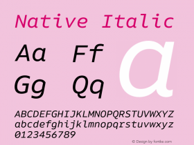



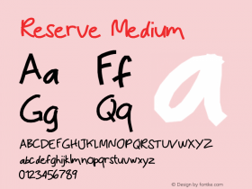
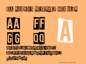
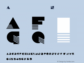


-
 ShanhaiFonts
Brand:山海字库
Area:China

-
 Cangji Fonts
Brand: 仓迹字库
Area: China
-
 JT Foundry
Brand: 翰字铸造
Area: Taiwan, China

-
 Handmadefont
Brand:
Area: Estonia

-
·千图字体
-
 HyFont Studio
Brand: 新美字库
Area: China


- ·London Underground's iconic Johnston Sans typeface
- ·How to sell your typefaces
- ·Make market-ready fonts with this 8 point checklist
- ·The Form Book by Borries Schwesinger
- ·Type terms: the animated typographic cheat sheet
- ·Japanese Typography Writing System
- ·Benetton identity redesign
- ·Hollywood Star Matt Damon Wrote Better Chinese than Chinese Stars
- ·Statement and Counter-Statement, Automatically Arranged Alphabets, and Arts/Rats/Star
- ·Top 100 Fonts.com Web Fonts for May 2016