


Un Giro di Sporco Sud


Source: http://www.ungirodisporcosud.com.© Patch Hofweber 2013. License: All Rights Reserved.
For Pista Malmø's spring classic race, the 2013 site builds upon Neutrafaceas a starting point we needed a fitting text face and webfont stand-in for titling.Proxima Nova, albeit a tad ubiquitous at this point, was a good match. Mark Simonson's Art Deco influences are toned-down, but still evident in the minuscule 'a', among other glyphs.
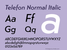
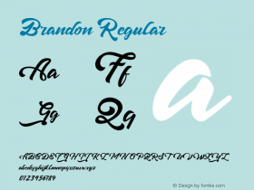
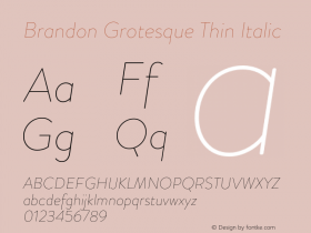
The titling stand-in proved to be difficult a task:Brandon Grotesque's corners were too soft,Le Havreused a faux-bold and had other inconsistencies, andRelayhad apertures that were far too open. The answer was in front of my nose –Telefonwas a perfect match. With one exception – the 'R's leg connected near the stem, rather than right out on the bowl. Luckily, Monokrom was kind enough to sponsor with an alternate 'R', making for a special little event.
Photo © Gustaf Emanuelsson 2013

Source: http://www.ungirodisporcosud.com.© Patch Hofweber 2013. License: All Rights Reserved.

Source: http://www.ungirodisporcosud.com.© Patch Hofweber 2013. License: All Rights Reserved.


-
 ShanhaiFonts
Brand:山海字库
Area:China

-
 Cangji Fonts
Brand: 仓迹字库
Area: China
-
 JT Foundry
Brand: 翰字铸造
Area: Taiwan, China

-
 Handmadefont
Brand:
Area: Estonia

-
·千图字体
-
 HyFont Studio
Brand: 新美字库
Area: China


- ·Alibaba Supports Font Infringement Complaints
- ·Cocoa Marsh Instant Fudge Candy Mix packaging
- ·"Fantastic!" ad for Captain Fantastic & the Brown Dirt Cowboy by Elton John & Bernie Taupin
- ·Surabaya Beat by Beat Presser, Afterhours Books
- ·Quimbaya Coffee Roasters
- ·Bevésett nevek (Carved Names), vol. 2
- ·Fonts Design of Childhood Memory
- ·Japanese Typography Writing System
- ·"Die Alpen – Vielfalt in Europa" stamp
- ·MC5 – Back in the USA album cover