



Fontke.com>Article>Details
PBS Logo (1971–84)
IntroductionSource: http://containerlist.glaserarchives.org.License: All Righ


Source: http://containerlist.glaserarchives.org.License: All Rights Reserved.
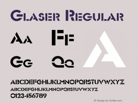
The second PBS ident was used from 1971 to September 30, 1984. It features cel-animated tricolor letters that assemble onscreen to form the logo, similar to the concepts used for production logos from that era, such as those from MTM Enterprises. his ident was designed by Ernie Smith and Herb Lubalin of the Lubalin Smith Carnase design studio, on assignment from the Lawrence K. Grossman advertising agency, whose creative chief, Ron Aigen, directed the logo search. — See the 1984 redesign.
Relevant font family




Relevant font designer

PBS Logo (1971–84) Comments
PBS Logo (1971–84) Latest comments
No relevant comments
-
 ShanhaiFonts
Brand:山海字库
Area:China

-
 Cangji Fonts
Brand: 仓迹字库
Area: China
-
 JT Foundry
Brand: 翰字铸造
Area: Taiwan, China

-
 Handmadefont
Brand:
Area: Estonia

-
·千图字体
-
 HyFont Studio
Brand: 新美字库
Area: China


Recommended font article
- ·How to sell your typefaces
- ·Brother Moto Flat-Trackin' Tee
- ·Jim Nutt: Coming Into Character at Museum of Contemporary Art Chicago
- ·"David Bowie is turning us all into voyeurs" button
- ·"Die Alpen – Vielfalt in Europa" stamp
- ·Hollywood Star Matt Damon Wrote Better Chinese than Chinese Stars
- ·Bevésett nevek (Carved Names), vol. 2
- ·MC5 – Back in the USA album cover
- ·New York New York, Jazz St. Louis
- ·Food Not Bombs hypothetical redesign