



Paulette's Original Donuts & Chicken


Source: http://paulettesoriginal.com.License: All Rights Reserved.
Paulette's is a fried chicken and donut shop in Toronto.
It is a shame the designer for Paulette's used shoddy free-font versions of classic old typefaces when much better digitizations are available. They could benefit greatly by using Troubadour Pro Engraved instead of Beachman Script, and LTC Nicolas Cochin instead of Cock. By using the better digitizations, they would experience far fewer problems like the huge space between V and E in "EV ENTS" on their website, or the noticably uneven curves in their logo.
I was unable to identify the other script used on Paulette's website. If anyone recognizes it please feel free to share.

Source: http://gliha.blogs.com.License: All Rights Reserved.

Source: http://www.the-food-files.com.License: All Rights Reserved.

Source: http://www.flickr.com.License: All Rights Reserved.

Source: http://www.postcity.com.License: All Rights Reserved.

Source: http://www.flickr.com.License: All Rights Reserved.
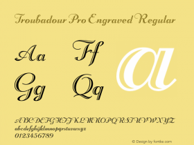




-
 ShanhaiFonts
Brand:山海字库
Area:China

-
 Cangji Fonts
Brand: 仓迹字库
Area: China
-
 JT Foundry
Brand: 翰字铸造
Area: Taiwan, China

-
 Handmadefont
Brand:
Area: Estonia

-
·千图字体
-
 HyFont Studio
Brand: 新美字库
Area: China





- ·Troubadour poster, Opera Plovdiv
- ·Ad for Vincebus Eruptum by Blue Cheer
- ·London Underground's iconic Johnston Sans typeface
- ·Alphabet Stories by Hermann Zapf
- ·Bevésett nevek (Carved Names), vol. 2
- ·Iconic Transport for London logo undergoes subtle redesign
- ·Cocoa Marsh Instant Fudge Candy Mix packaging
- ·New York New York, Jazz St. Louis
- ·He Invented a Font to Help People With Dyslexia Read
- ·Linotype Ad: "Linotype vs. Intertype"