



Volkswagen ad, c. 1955


Source: http://www.flickr.com.License: All Rights Reserved.
Heinrich Jost's Beton series for the Bauersche Gießerei was started in 1929 with the Black (Extrafett). The Regular and the Bold (Halbfett) were released two years later, while two bold condensed weights were added in 1936. Beton is the French (and German) name for concrete.
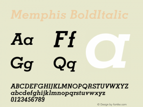
Also from 1929 on, D. Stempel AG published the competing Memphis family by Rudolf Wolf. In the early 1930s, the Egyptian revival really took off. Lots of foundries followed the trend and released their own version. This wave included Stymie (ATF, from 1931), Karnak (Ludlow, from 1931), Welt-Antiqua (Ludwig & Mayer, from 1931) – also known as Atlas (Lettergieterij Amsterdam), Landi (Società Nebiolo), Rockwell (Monotype, from 1933), Cairo (Intertype, from 1933), Pharaon (Deberny & Peignot, 1933), Nil (Jan Idźkowski i Spółka, from 1934), Ultra (Schriftguß AG, c. 1935), and Nofretete (Genzsch & Heyse, 1939).





-
 ShanhaiFonts
Brand:山海字库
Area:China

-
 Cangji Fonts
Brand: 仓迹字库
Area: China
-
 JT Foundry
Brand: 翰字铸造
Area: Taiwan, China

-
 Handmadefont
Brand:
Area: Estonia

-
·千图字体
-
 HyFont Studio
Brand: 新美字库
Area: China


- ·20 Houses. A New Residential Landscape exhibition, Wallpaper* Architects Directory
- ·Bevésett nevek (Carved Names), vol. 2
- ·New York New York, Jazz St. Louis
- ·Once Upon DESIGN: New Routes for Arabian Heritage
- ·Quimbaya Coffee Roasters
- ·Troubadour poster, Opera Plovdiv
- ·Alibaba Supports Font Infringement Complaints
- ·How to Read a Painting by Patrick de Rynck
- ·10 Top Romantic Fonts on Valentine's Day!
- ·XUID Arrays: One Less Thing To Worry About