



Feusi Peyer Hubatka Architektur


Source: http://www.davidbuesser.com.David Büsser. License: All Rights Reserved.
New corporate design for a Switzerland based architecture studio. The idea of the design concept is based on the handling of space and proportions. The visual identity includes two characteristic design elements: the multiplication sign and the four terms. The plus sign in the former name Feusi + Peyer becomes the multiplication sign in Feusi Peyer Hubatka Architektur. The four terms define the frame of the format in different applications. The monogram finally reduces the basic idea of the visual identity in one sign.
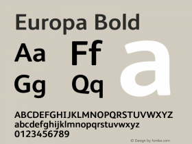
While the printed matter is set in Europa (Fabian Leuenberger, 2011), the website uses Canada Type's Gibson.

Source: http://www.davidbuesser.com.David Büsser. License: All Rights Reserved.

Source: http://www.davidbuesser.com.David Büsser. License: All Rights Reserved.

Source: http://www.davidbuesser.com.David Büsser. License: All Rights Reserved.

Source: http://www.davidbuesser.com.David Büsser. License: All Rights Reserved.

Source: http://www.fpharch.ch.David Büsser. License: All Rights Reserved.





-
 ShanhaiFonts
Brand:山海字库
Area:China

-
 Cangji Fonts
Brand: 仓迹字库
Area: China
-
 JT Foundry
Brand: 翰字铸造
Area: Taiwan, China

-
 Handmadefont
Brand:
Area: Estonia

-
·千图字体
-
 HyFont Studio
Brand: 新美字库
Area: China


- ·20 Houses. A New Residential Landscape exhibition, Wallpaper* Architects Directory
- ·Once Upon DESIGN: New Routes for Arabian Heritage
- ·Bevésett nevek (Carved Names), vol. 2
- ·Troubadour poster, Opera Plovdiv
- ·"Jesus Music" ad for Myrrh Records
- ·10 Top Romantic Fonts on Valentine's Day!
- ·XUID Arrays: One Less Thing To Worry About
- ·MC5 – Back in the USA album cover
- ·Chinese College Student Invents Smog Font
- ·How to sell your typefaces